Pages

Wednesday, 28 August 2013

Pop-up exhibition on Governors Island


Guest post by Clare White

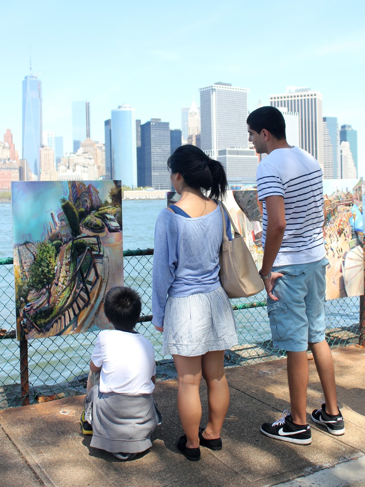
A bright Sunday morning was the perfect time to select some of the best paintings of the Pointon USA collection and put on a pop-up exhibition in front of one of the greatest views on Earth.

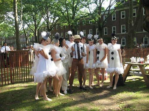
The free ferry to Governors Island runs every weekend so that New Yorkers and visitors can get out of the city and enjoy a wide range of attractions. Over the two days we visited we enjoyed splendid sights of bygone eras with a Jazz lawn party and classic VW display, plus kayaking and food with freshly made tropical juices from the different stalls.

Many artists have temporary studio and exhibition spaces in the attractive buildings which used to house army families, so getting the paintings there was straightforward.

Attached securely to the seafront, the oil paintings of New York and San Fancisco looked stunning against the Hudson River and skyscrapers of Manhattan.


As one of the prime photo opportunities in New York, it wasn't long before the paintings, with their highly recognisable views, drew attention.


Rob completed oil painting number 15 painting of Manhattan and the immense choppy river with its constant criss-crossing traffic of all sizes.


When we got there, the trees - noisy with the hissing of beetles - were casting shadows onto the paintings and it was several hours before the sunshine really brought out the bright, vibrant colours of these American paintings.

The sun beats down hottest in late afternoon so that was when we took the exhibition down and headed off to join the queues of classic VWs for the ferry back off the Island.


Probably one of the most relaxing gallery spaces I have ever seen!

Monday, 26 August 2013

Oil painting 14 - Manhattan from Governors Island


The island is a free ferry ride from lower Manhattan. It is only open to the public at weekends, which turns it into a popular recreational getaway for New Yorkers. Formerly owned by the military, it contains a disused fort, barrack buildings and homes for army families.

It was damaged by Hurricane Sandy and has a dilapidated, informal atmosphere where it feels as though the crowds have taken over and can do whatever they like. During the days we were there it had a jazz lawn party, which meant the ferry was filled with spectacularly dressed visitors, and a VW rally.

It is only when you move away from Manhattan that you realise how high the new Freedom Tower is, and although I thought I was familiar with the New York skyline, this view was completely new. Painting a wide tidal water rather than the canal or a lake was also new, I hadn’t done much study of large expanses like this. A lot of the same rules applied as with the Year of the Boat but there are far fewer reflections and I was trying to summarise the repetition of the waves with strokes. We had two beautiful days of constant sunshine which meant the days were full of vibrant colours and I captured the contrasts of sun-hit land and water. As with the balusterade in Bryant Park, I consciously didn’t adjust the straight line perspective into a curve as we track round the wide angle view, keeping it as a straight edge to give a sense of the rigidity of the land against the organic water. Curving the line would have softened that effect.

Two small boats appear in the painting although a lot of crafts of different sizes came, including the Staten Island ferry and a large clipper. I deliberately avoided the rest of the boats so I could focus on the water.

Although faced with one of the most spectacular man-made skylines in the world, I pushed it up to the top of the view, preferring the impossibility of painting water and this natural expanse. From this vantage point, it looks like a small tropical island but one that has been crammed full of skyscrapers. While the other New York paintings are in the centre of walls of skyscrapers, giving at best a breathing point in a green square, this view allows you to take a breath and appreciate the vibrant energy of the city by stepping away from it.


Wednesday, 21 August 2013

Oil painting 13 - Summer in Bryant Park


Bryant Park, at the rear of New York Public Library, was well located in-between the paintings at Grand Central Terminal and Times Square so that I could work across multiple paintings in a day. It is very formal in structure, with a large central lawn.

This was a favourite place to paint and spend time: it has become a branded visitor attraction with a unique, enjoyable atmosphere. There is a busy programme of events including chess players, table tennis and the best public toilets in the city playing classical music. While we were there we watched ET with thousands of other enthusiastic people on the lawn underneath the moonlight. The classical furnishings and avenues of trees make it an oasis from the surrounding city.

I have condensed the vista on the left to include the Empire State Building and Bryant Park Hotel. I’ve kept the perspective straight on the balustrade and along with other linear features it funnels us into the stylised tunnelling of the avenue of trees.

This was a good space to work and engage with the public, people felt relaxed enough to start quite in-depth conversations. I think this painting really sums up summer in the city.

Oil painting 12 - Times Square looking north, New York


Although I was pleased with the feeling of height in the first painting of Times Square, I didn’t feel this painting summed up the magnitude of the visual spectacle of the movement and people, the joyous challenge of painting such an energetic scene, bizarre heights and extreme depths. I did a further painting and could have done more. While other subjects would fall flat if the weather was dull, Times Square is colourful and alive at all times, day or night.

For the painting looking north, I flipped the canvas to landscape and pushed the avenue to the extreme right. This gave enough room across the composition to get a sense of the fast-moving, blurred traffic.

There are few places in the world where you’re being attacked by quite so many brands at once, your vision filled up by so many names and adverts. I was consciously trying not to be drawn in and give them extra attention than the rest of the landscape. I painted them with as much detail as I would a tree, not giving them any special treatment. Famous logos of global brands that we are familiar with have been painted in an impressionistic style as if I’d never seen them before, summed up as strokes of colour rather than necessarily copying the lettering.

The painting includes other familiar American sights including the Naked Cowboy, singing for every passing tourist and a pair of trainers hanging from the overhead wires.

This area has a nearly Bladerunner feel to it with its neon signs and height of the futuristic city.


Oil painting 11 - Times Square looking south, New York


Thinking I’d have trouble setting up in such a well-known location, I spoke to the NYPD in their booth which doubles as an army recruitment centre, but they were very relaxed. I set up and straight away blended into the mass of entertainment.

I am breaking composition rules by having a central vertical band running up the canvas, but I knew it would stand out as an oddity and wanted to draw attention to the thinness of the building which occupies the space between Broadway and Seventh Avenue. 


I also wanted to invite a comparison between the two halves of the painting with pedestrians on the left hand side and traffic on the right. I flitted between these two different worlds by alternating which side of the easel I looked around; these two slightly different vantage points helped me to eliminate a drab flowerbed which would otherwise have been in the foreground.

The main thing you want to capture in Times Square is the bright artificial colour: the primaries of the yellow taxis, the red of the parasols in the foreground were constants amongst the sea of changing LED advertising boards.

It’s not a very enjoyable place to spend time. It was quite unnerving painting so close to fast-moving traffic, which must cause a lot of injuries in the square. You feel that you’re being assaulted visually by changing lights and it’s an impossible phenomenon to paint, but at the same time stimulating. I couldn’t have predicted what the end result was going to look like because the scene changed every time I looked up.

A little boy gave me a can of diet coke, the only tip I received, putting me well behind multiple Elmos, Batman and other characters of the square.

Monday, 19 August 2013

Oil Painting 10 - Gapstow Bridge over the Pond, Central Park


This site was a private commission, for friends who got engaged on Gapstow Bridge. The Pond is lovely, full of terrapins and surrounded by greenery, the park holds back a wall of old buildings and is one of the most recognisable views of New York. 

To see old, attractive skyscrapers like this is a delight because Britain never built as high as this during this period. Art deco buildings set off newer glass buildings and this mix is pleasing. 

The design of Central Park works very well, with the sudden change from Manhattan’s grid format; the curvy paths are disorientating, meandering and this encourages relaxation. During the time of producing this piece we staged an impromptu painting class with some friends that had flown over to visit, and we achieved an enjoyable sense of escapism from a potentially intense citybreak.

I condensed the view slightly to bring the bridge into the same image, which leaves people at the very left hand side looking at the view with us. 

This painting has been left in a looser state than the majority from this trip as it reached an unexpected state of satisfaction for me, after two short sessions. I had been looking at the landscapes of Paul Cezanne in the MoMA and the Metropolitan Museum of Art and have been enjoying how he can summarise the majority of a landscape in a patchwork of patterned brushstrokes, and only give a different treatment to the point of focus. I am attempting a similar treatment with this piece, directing our eyes quickly past all the framing foliage of the park by representing it with broad repetitous pattern, and holding our interest in the very different, vertical treatment of the city and pond.

Oil painting 9 - Grand Central Terminal, New York


For the first few days in New York City, we walked around everywhere from the East Village to Central Park in order to get a sense of possible locations around Manhattan. This was the first location I settled upon, celebrating its 100th anniversary in 2013. 

People are constantly streaming in and out of the station and it was exciting to be walking down 42nd Street with all the office workers at 9am, comparing my career to theirs.

The usual iconic view of Grand Central is from the inside and the spectacular main concourse. This outsider’s view, in a smoking area for office workers, is full of movement and colour, points of focus and different height levels. 

Working within the tall avenues of skyscrapers meant their shadows were constantly shifting with the sun tracking round,  giving short windows of opportunity to paint each section in full light. While the sun was on my side of the street I painted the people and yellow taxis in the foreground, then as it shifted over I’d paint the light first catching the station. 

Using an Indian yellow for the first time worked well with the reflected sunlight of the golden stonework of Grand Central Terminal. 

This was the first time we had moved paintings around using public transport as we had been in walking distance before. I learned to position myself in the centre of bendy busses, a dead zone that gave me storage.